
Corporate Design for inkythoughts art
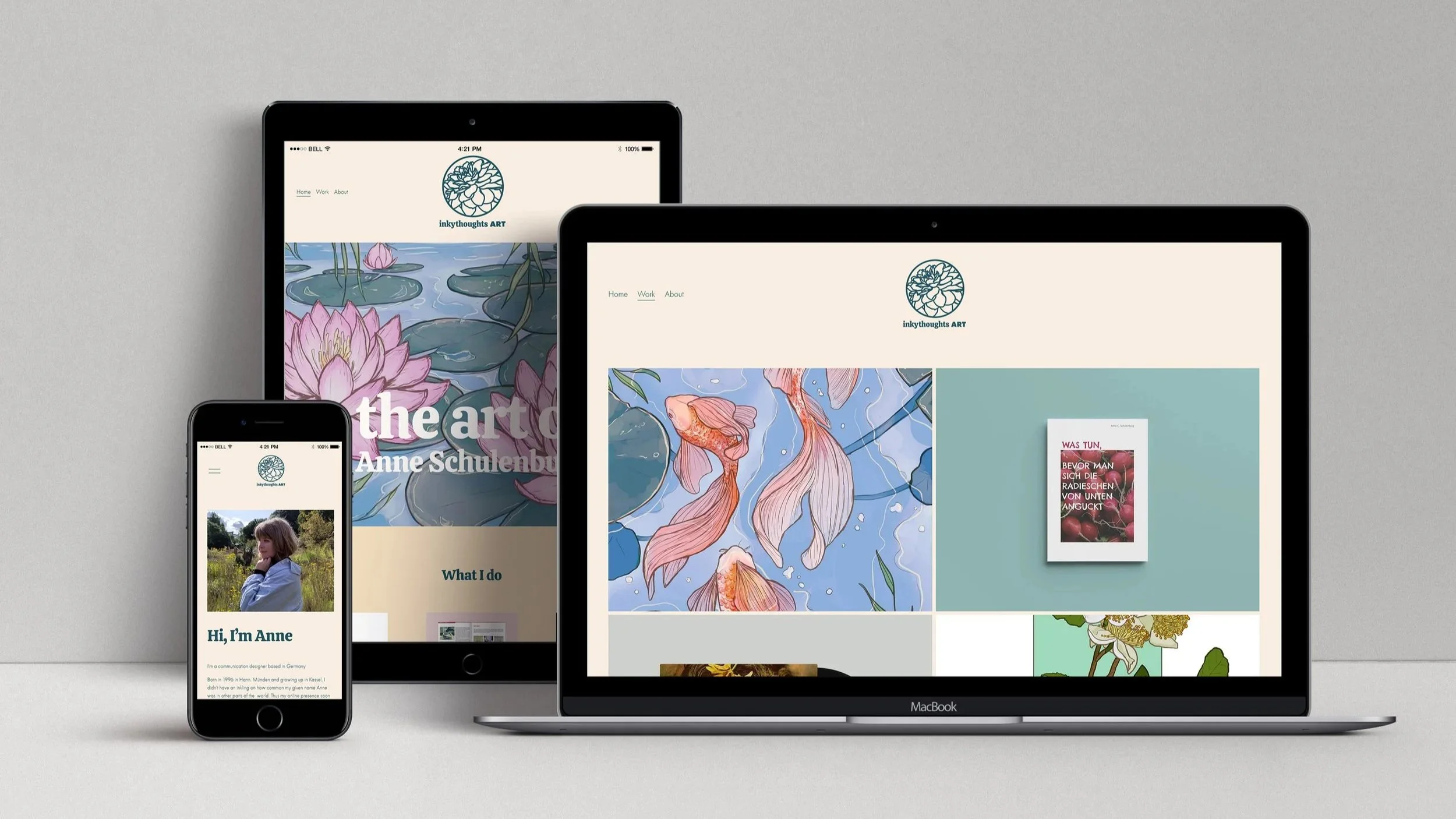
With me starting freelance, I obviously wanted a professional presentation for my work. I wanted branding that was clean, to work as a blank canvas for my idividual projects, aesthetically pleasing, as that is the cornerstone of what I do, and calm and intricate, as I am not a loud person but value quality and attention to detail.
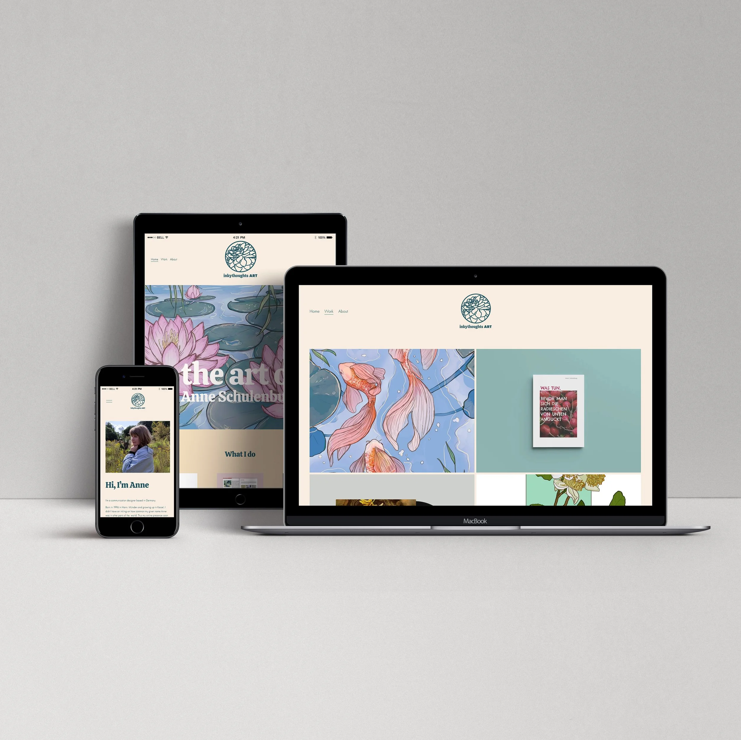
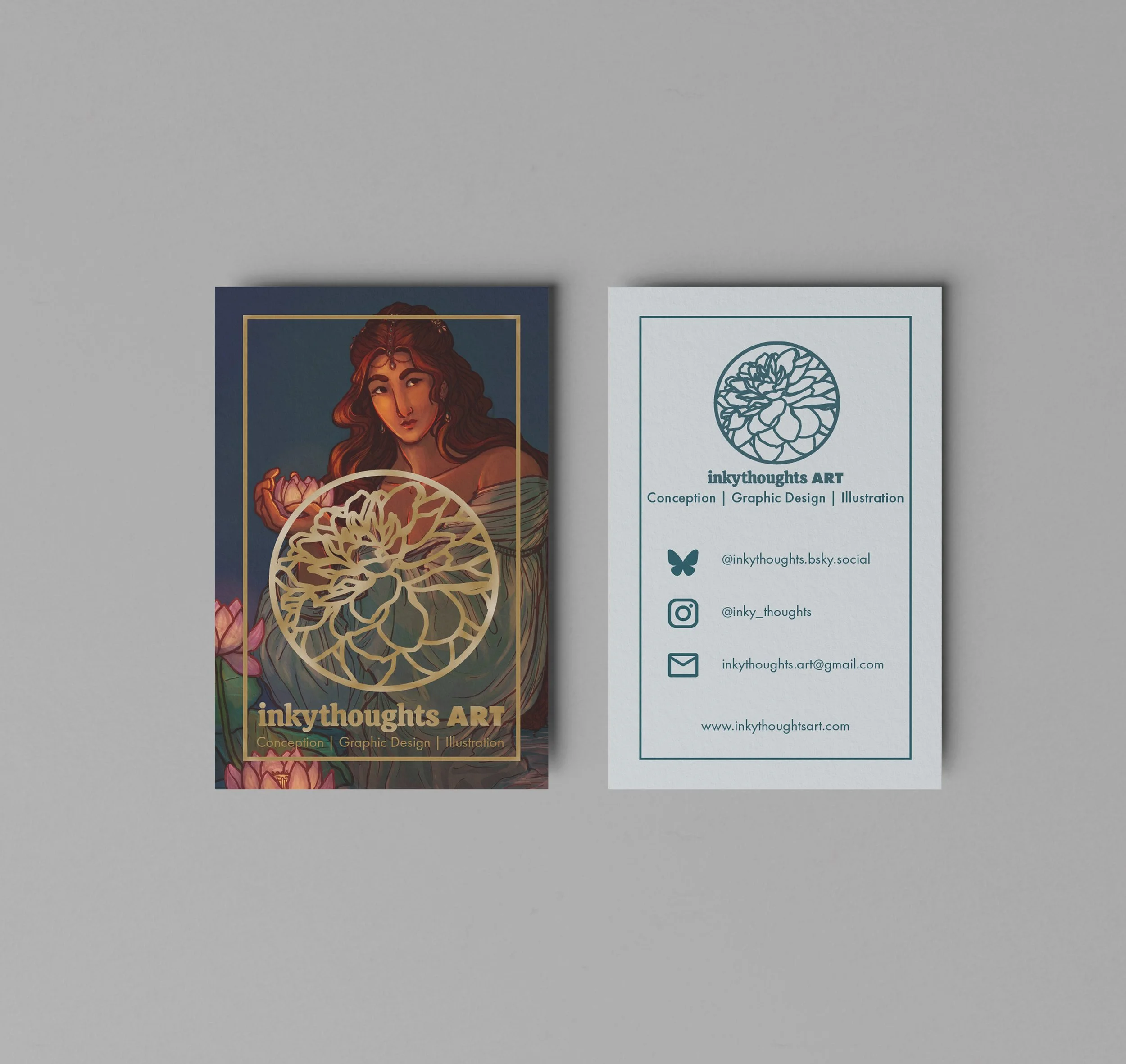
With this in mind, I developed my branding with several interations until I came to the design that I use now. I developed a logo in several variations, stationary and business cards for communication, this very website, as well as apparel to wear during convention appearances.
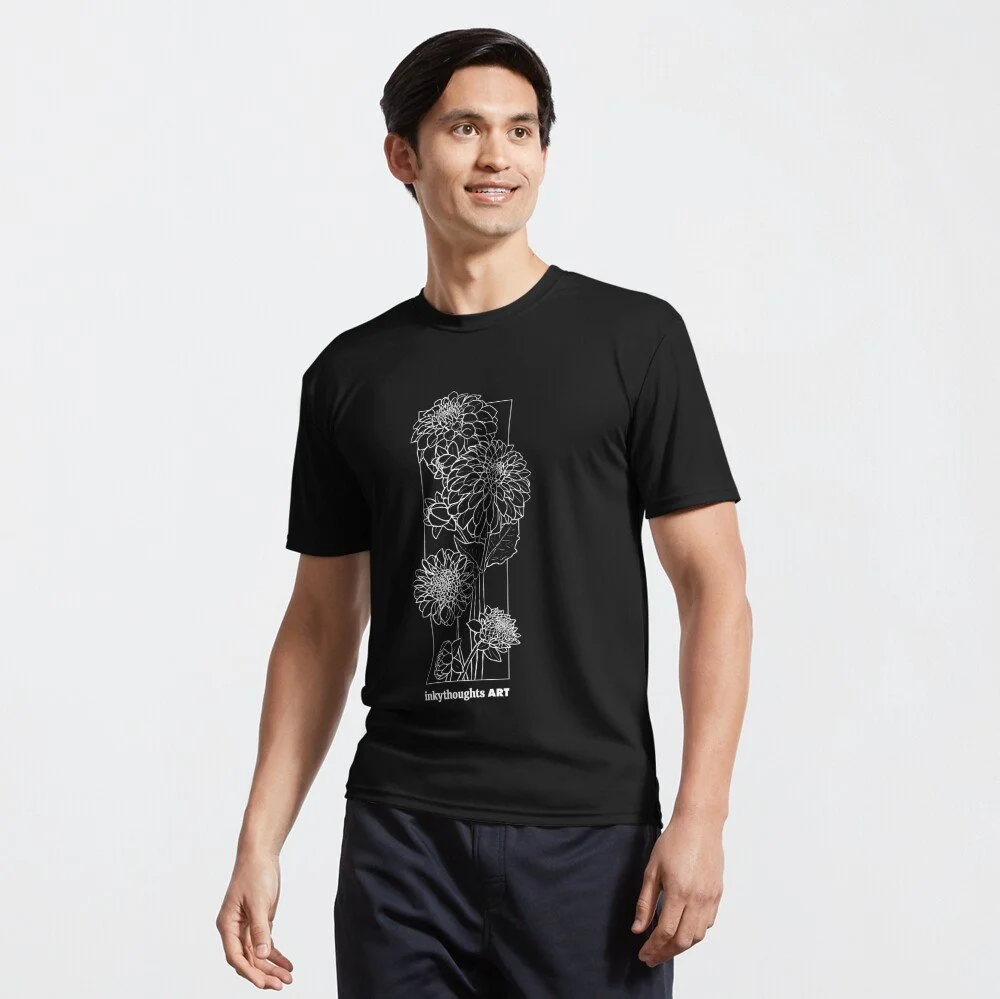
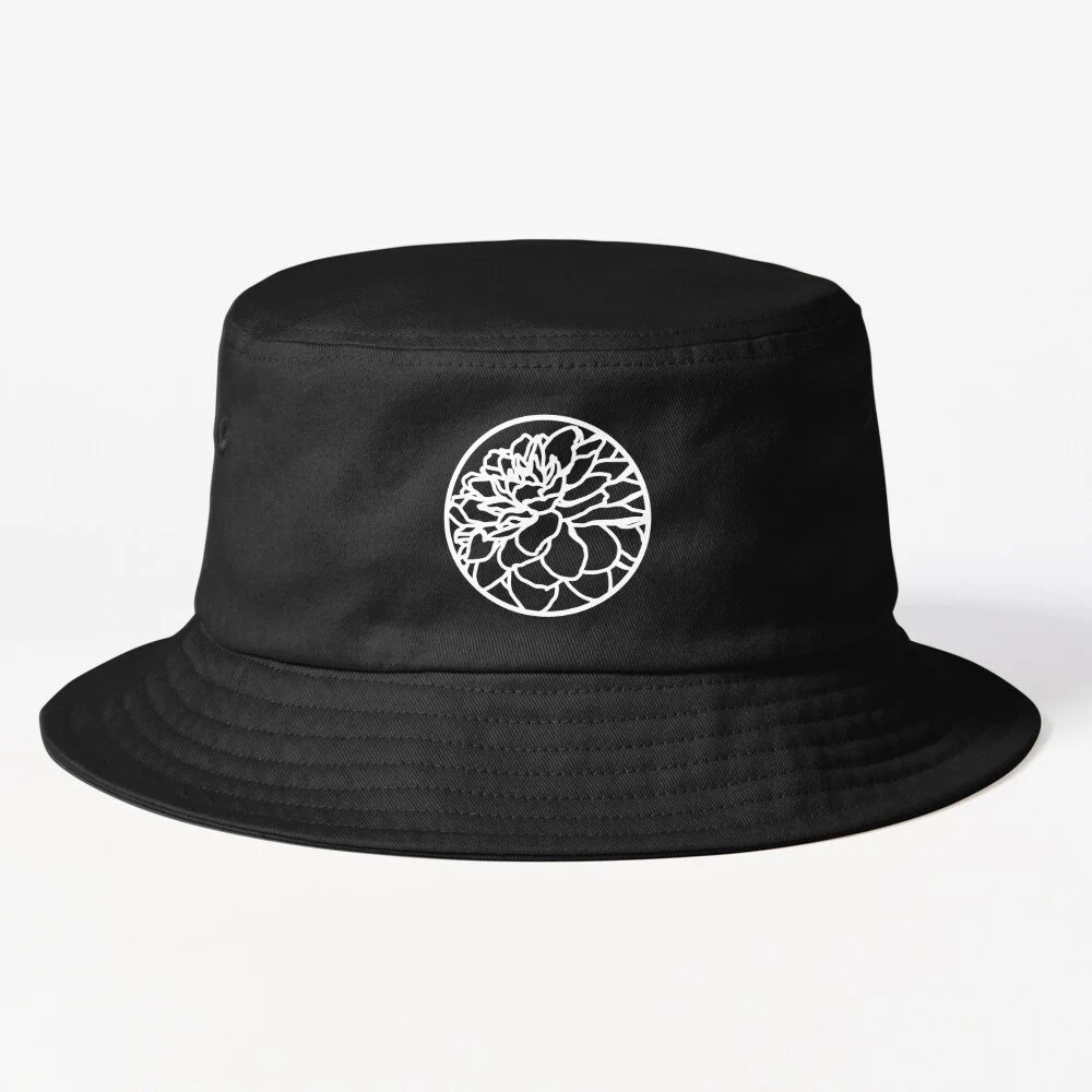
About the design
During prior research I found that the dahlia represents “good taste” in Japanese hanakotoba. To use a flower with a specific meaning was quite fitting since I like natural elements like flowers in my personal work and have been heavily influenced by East-Asian art as well. Similarly to the Korean dojang, Japanese inkan, or Chinese yinzhang that I first encountered as vermillion artist signatures on ink paintings, I intended to use my logo in a similar, aesthetically pleasing way for my work.
Futura is a classic design font ever since its creation in 1927. The geometric sans-serif is simple and clean in its appearance and represents the design aspect of my work. It is well thought-out and was intially used for an affordable housing project. While I do know my worth, I do not want my work to be “exclusive” and my goal is to find qualitative, realistic, and thought-out solutions for my clients.
On its own, Futura appears a bit too “cold” and rational, though. Since I consider myself a warm and genuine person, I believe this is also a component in my work and ought to be represented in my branding. My choice fell onto the Calistoga font, a quite rounded dynamic serif that was inspired by Oscar M. Bryn’s Santa Fe Railroad poster lettering. It is quite versatile as a display font and works with many different styles and aesthetics while not being absolutely run-of-the-mill like Garamond or Georgia. Despite its vintage inspiration, it still works well in more modern design, a line I personally straddle with my work as well.
The colour scheme developed from a dark forest green and gold, a combination I find very elegant and sophisticated. It didn’t quite fit my current style quite, though, so I tweaked the colours, especially the green, into a more calming, more blue-hued, petrol. The gold is still used, albeit minimally, and instead the focus is more on a warm cream that contrasts well with the petrol.